Menu Close

Logos and Usage

Section contents:

Primary Siemon Company Logo

All logos and guidelines for their usage must be adhered too. Any required edits to existing logos, or the production of a new logo, must be pre-agreed with the Siemon Corporate Marketing Team. Please email Marketing_US@siemon.com for more information.

The Red/Black version is the first-choice logo to select whenever reproducing in full color. The Black or White versions should always be used if reproducing the logo in Black and White (i.e. not full color). If the Red/Black version is selected, when printed in monochrome the logo will appear faded.

The company typeface within the logo is the font ‘Serpentine Bold’. The typeface embedded within it must not be changed because it is part of the defined logo.

  • This typeface should not be used in any other communication
  • The tracking on the Siemon lettering is equivalent to 310 at 44pt font size
  • There are four versions of the Siemon logo available
  • Do not change, redraw or alter the wordmark or its proportions

PNG        EPS


PNG
        EPS


PNG
        EPS


PNG
        EPS

Spacing and Sizing

To ensure the Siemon logo is always prominent, there is a minimum exclusion zone area surrounding it.

  • No other graphic or text element may appear within its zone.
  • The zone must be used in all applications of the mark.
  • The minimum required area surrounding each version of the Siemon mark is in proportion to the overall dimensions of the mark. This relationship stays the same, whatever the marks reproduction size.
  • The illustration shows how to establish the zone, the logo size is expressed as a ratio to the exclusion required around it.

To present the Siemon brand properly, it is essential that the mark be reproduced with consistent quality. No version of the Siemon mark may be reproduced below the minimum size specified below. This illustration shows the dimensions for minimum size.

Secondary Logo

Stacked Logo
The Stacked Logo is subordinate to the Primary Logo. Only use this version of the logo where the Primary Logo does not work. Spacing for this logo is equal to 1/3 of the height and width of the logo.


PNG        EPS


PNG        EPS


PNG        EPS


PNG        EPS

Tertiary Logo

Icon
The Siemon icon should appear no smaller than one-quarter of an inch wide or 24 pixels. Spacing for this icon is equal to 1/3 of the height and width of the logo.

This icon is designed for use in small areas that already are on a Siemon branded piece of material, such as a social media post or flyer with other Siemon branding on it. It must not be used alone; it is less formal and used in applications in which the relationship to Siemon and its full name is distinct.

Suggested Usage
The icon is ideal for use on social media posts, small packaging and branded marketing collateral such as: pens, power banks and travel mugs.


PNG        EPS


PNG        EPS


PNG        EPS


PNG        EPS

Usage Hierarchy

Use the Primary Logo wherever possible.

The Secondary and Tertiary logos are designed to reinforce the already branded Siemon asset.

Primary Logo

Secondary Logo

Tertiary Logo

Correct Usage

We have made it easy to use the logo correctly by supplying files ready to use in the correct format. Use these and you will not go wrong.

The examples A – D demonstrate correct use of the Primary logo

A


Full color logo on white background.  To be used in most circumstances.

B


Black color logo on white background.  Only used when color isn’t available or using a very small size logo.

C


White logo on black background. Only use when color isn’t available or using a very small size logo.

D


Full color logo on black background. To be used in most circumstances.

The Siemon brand mark will be applied using a wide range of printing and reproduction techniques, to an equally wide range of base materials. It is therefore important that you consider carefully the technique and base materials before choosing the appropriate mark type. For example, if producing a color logo, you should use a technique that will guarantee the accurate registration of the colors. Similarly, if you are using a single-color logo, the reproduction method and base material should ensure the mark appears crisp and clearly.

Incorrect Usage: The following are examples of how not to use the Siemon logo.
DO NOT


Overlap the logo


Tilt the logo


Change any colors


Use the white logo on a white background


Use the black logo on a dark background


Use the logo on a multicolored background


Apply an outline or stroke


Skew or distort the logo


Outline or stroke the white logo


Put a box around the logo

Embossed or Etched Versions

In order for the Siemon logo to appear on items where size and reproduction methods will reduce its clarity the standard single-color logo should be used.

It should be used in black (example E below) or etched onto metal (usually reverse as in example F below). All guidelines on color and background must be followed. The logo may be used in either the positive or negative form.

Minimum acceptable dimensions for reproducing the Siemon logo in this format are: 1.25in W x 0.5in H (32mm W x 13mm H).

Examples of reproduction where use of the small promotion mark may include: embroidery, embossing, engraving. E.g. partner web site/promo material where limited space available, small promo items such as golf tees, pens etc.

E

F

Logo Colors

The colors shown below are those used to represent Siemon and its brand identity – Pantone 185, Black and White. Due to the fact that they will be applied to a wide range of materials and finishes it is not possible to list specific color references for all applications, however we have listed the references for use in print and electronic documentation, which are the most common formats used.

Pantone 185
R: 239 G: 62 B: 66
C: 0 M: 91 Y: 76 K: 0
Hex: #EE3A43

Black
R: 0 G: 0 B: 0
C: 100 M: 100 Y: 100 K: 100
Hex: #000000

White
R: 255 G: 255 B: 255
C: 0 M: 0 Y: 0 K: 0
Hex: #FFFFFF

Print/Electronic References

When on a standard web or sheet fed press, accurate color reproduction can be achieved by
accurately matching to solid PANTONE colors (PMS 185), the standards for which are shown in the PANTONE color formula guide 1000.

Important: When printing onto uncoated paper (this applies to letterhead and business cards) the print vendor must be aware to run job at a density reading of 1.19 through the magenta filter on a densitometer for a richer looking Pantone 185. Otherwise global inconsistency of color of logo will occur.

When printing process color, the color breakdown is as follows:
C = 0, M = 91, Y = 76, K = 0

For electronic communication, the Red, Green, Blue (RGB) breakdown is as follows:
R = 239, G = 62, B = 66

Please note: The colors printed on this page are not intended to match to the PANTONE, CMYK or RGB color standards. They are for use as a guide only and must not be used for color matching during the proofing process.

Website/Electronic Usage

Any use of the Siemon logo on a third parties’ website should incorporate a hyperlink back to the appropriate Siemon site. The URL www.siemon.com should be used as the default option. In order for the logo to appear prominent on a web page, we recommend a minimum exclusion zone of 5 pixels (at 72 dpi) around the logo.

If the logo is used in animation, video, PowerPoint presentations, or other rich media, the logo should not be animated, distorted or embellished in any way.


Co-Branding Guidelines

Frequently we work with various partners on joint marketing campaigns. The information below provides clear guidance on how to execute co-branding activities for Siemon with other partner brand assets.

Logo Treatment

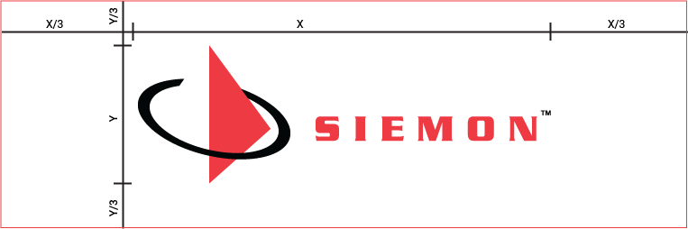
In order to ensure that each logo has visual impact and conveys the appropriate relationship we need to define clear space and margins between them.

Logo Treatment advert

Depending on the background chosen, the selection of full color/single color logos needs to be considered to ensure that all the logos are correctly visible. Regarding separation distances, please ensure you adhere to the Siemon logo spacing and sizing parameters and ensure that all partner logos are equally spaced.
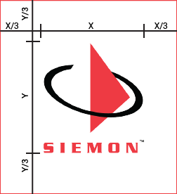
Logo Positioning

Logo Positioning Advert

Each logo should be vertically/middle – aligned for the best balance. The left position of the logo indicates brand dominance in brand-neutral environments. This positioning will typically be driven by the instigator of the activity and/or with the logo of the best-known brand in the market.
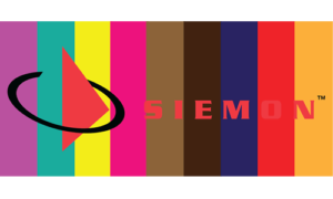
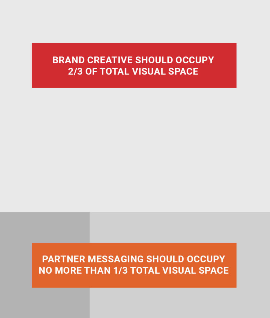
Partner Visuals

In select instances, a partner might want an expanded CTA to include visuals. Though it’s not common practice, this is how we would do that while still maintaining our brand’s look and feel.

  • Brand creative should always take up at least two thirds of the overall visual space

  • Partner messaging — including visuals, CTA and contact information — can occupy up to one third of the real estate

  • Partner visuals, such as headshots, should take up no more than one quarter of the allocated partner space

Partner Visuals

Product Marking

Product marking is an important piece of Siemon’s overall branding effort.  Well-placed, legible, and brand consistent product marking not only contributes to a positive first impression of quality when potential customers see our products in marketing materials, in product displays, or when they first “unbox” purchased products, it is one of the longest-living company representations – often remaining visible for the full lifecycle of installed or used product.

The product development team must engage Siemon corporate marketing in any product marking decisions involving logo use as well as any visible, permanent product marking (such as patch panel port numbering, rack space/U indicators, etc.)  This includes any Siemon-branded product, including fully-Siemon produced, third party designed or produced, and co-branded Siemon products.  Marketing should be consulted prior to final product design, once the following basic product parameters have been determined:

  • Product size/product imprint space
  • Product color
  • Available marking options (screen, laser, molded, applied badging, etc.)
  • Limitations of available marking types (EX:  molding “resolution” vs screen-print resolution, color)
  • Product handling expectations (to determine marking durability needs)
  • Installed product visibility

Division Logos

Minimum spacing requirements are the same as the primary Siemon logo
The font is ‘Serpentine Bold’
The font tracking is set to 25
The second line of text is spaced below by 1/2 the X height of the Siemon text
The secondary text is always in ALL CAPS
Colors are the same as the Siemon company logo

Regarding logo straplines/sub headers – e.g. Siemon Certified Installers, Siemon OEM Technologies, etc. – In certain logos, straplines/sub headers may accompany the logo and should be treated as part of the official logo when present. Do not make changes (sizing, copy, placement, or color) to straplines/sub headers without proper approval.

View current trademark information

Siemon OEM Technologies

Siemon-OEM-Technologies

Siemon Global Project Services

Program Logos

Siemon Connect

Siemon_Connect

Siemon Certified Installer

Siemon Certified Data Center Integrator

Siemon_Certified_DataCenter_Integrator

Siemon Authorized Distributor

Siemon_AuthorizedDistributor_RedBlack

Siemon Sustainability Pledge

  • Full Color  | PNG

RapidDAC™

logo_rapiddac

Service Logos

Siemon Professional Services

Siemon_ProfessionalServices

Solution/System Logos

Siemon Advanced Data Center Solutions

Siemon Advanced DataCenter Solutions Logo

Product Logos

EagleEye Red®

LC BladePatch®

Siemon_LC_BladePatch

LightBow

LightVerse®

Siemon_LightVerse

LightStack®

Siemon_LightStack

LightWays®

Siemon_LightWays

MapITG2™

PowerGuard® +

PowerGUARD-Plus

Z-PLUG®

UltraMAX™

Siemon_UltraMAX